ttf-inconsolata: an open font for your terminal and for nice code printouts
August 15th, 2007 edited by anaArticle submitted by Nicolas Spalinger. We have run out of good articles! Please help DPOTD and submit articles about software you like!
You love the command-line interface but you also want things to look good and be free as in freedom? Maybe you’re looking for a good open font to use when you code? or something to make your code snippets look even better in a printed publication?
Then check out ttf-inconsolata!
What is it?
Inconsolata is a monospace font designed by Raph Levien of Advogato and Ghostscript fame (and quite a few other things).
It is a high-quality font released under the Open Font License (OFL), the community-approved free license specifically designed for fonts and collaborative font design. (See http://scripts.sil.org/OFL for all the details including a extensive FAQ).
Screenshots taken from inconsolata’s website: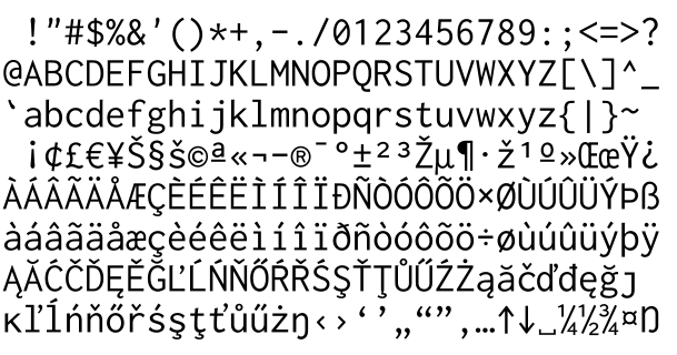
How does it compare to other fonts?
This fonts really stands out compared to other fonts out there for the following reasons:
It’s an open font which comes with sources! The great thing about this font is that extended sources - not just the ttf - are made available by the designer: the Fontforge .sfd and the Spiro .plate sources are available on the upstream website and in the source package. A Type1 version of the font is also available.
It is a collaborative font project: you can freely use, study, modify, redistribute and/or sell the font under the terms of the OFL which means you are free to derive artwork from the font, to embed it in a pdf, to branch, extend and tweak the fonts to your liking. You can also send a patch to contribute to Raph’s project.
It is also the result of cutting-edge innovation. Raph has been using his own font design toolkit called spiro to design Inconsolata. Spiro is based on revolutionary curve technology implementing Euler spirals. The spiro toolkit also includes various optimisation scripts. See http://levien.com/spiro for all the details.
It is work in progress (the coverage is mainly Basic Latin, Latin Extended-A and Latin-1 Supplement at this stage) but it is already very useful as such and has great potential to grow to support more Unicode blocks as needed.
This open font project is being generously sponsored by the TeX Users Group Development Fund which you can contribute to.
You can also use Inconsolata directly from your TeX environment using newer implementations like XeTeX or pdfTeX.
Alright, how do I get it?
Thanks to work done by the Debian fonts task force (See the corresponding Alioth project), Inconsolata is now available in Debian unstable and Debian testing. It will soon be sync-ed to Ubuntu.
It is co-maintained by the pkg-fonts team and the mirror Ubuntu fonts team. These teams are part of the open font movement working on improving the availability of high-quality open fonts, packaging the existing ones, integrating them with the wider free desktop stack, getting a toolkit together to do open font design and of course engaging more designers to release fonts under the OFL.
You can find other open fonts designed by Raph on his OFL fonts page
And many other open fonts projects are listed at: http://unifont.org/fontguide, http://scripts.sil.org/OFL_fonts and http://www.openfontlibrary.org/
Free the glyphs :)
August 15th, 2007 at 11:12 am
The font looks very blurry on 12px, my normal monospace font-size. Not usable for me.
August 15th, 2007 at 11:56 am
This is probably due to other settings in your font rendering stack. It’s looking georgious here on my terminal from 9 to 12 pt.
August 15th, 2007 at 2:27 pm
How could anyone create a monospace font with a zero that looks like a capital o? Immediately worthless.
August 15th, 2007 at 7:01 pm
I have to agree with Ummm, a zero on a font designed for computer code must be marked so that it’s clearly not a letter “O”. Unmarked zeros are my biggest gripe with most monospaced fonts.
August 15th, 2007 at 8:15 pm
Well the beauty of collaborative open font design that if you don’t like something you’re free to launch fontforge, spiro, $coolfonthackingtool and branch the font to your heart’s content…
And in that particular case it’s already been done and the fontforge sources are also provided: http://www.damieng.com/blog/archive/2006/11/28/InconsolataDG–Slashed-zeros.aspx
August 15th, 2007 at 8:21 pm
Ouch, looks like WP doesn’t like the double dash in the URL.
This page has details about the Inconsolata derivative:
http://www.damieng.com/damieng/Typography/Converted/InconsolataDG.aspx
August 15th, 2007 at 8:43 pm
BTW, Bruce Byfield did a portrait of Raph Levien a while ago: http://www.linux.com/articles/58809
August 15th, 2007 at 10:52 pm
Thanks for the feedback about the slashed zero. Actually, I can easily disambiguate it from the O based on the width, but I can appreciate that most people don’t have quite the same eye for typographic subtleties. I was also generally trying to follow the example of the TeX fonts, which do not slash the zero. But based on the overwhelming feedback, the next version will have the zero slashed by default, and the unslashed version will be available through an OpenType feature. That’ll shift the blame off me and onto app developers who have not yet implemented all the OpenType feature goodness.
August 15th, 2007 at 11:58 pm
hey raph!
that’s very nice from you, thanks!
August 16th, 2007 at 8:47 am
Impressive… At first I was thinking “What the… A FONT on DPotD? And it’s considered ‘open’? What should be the benefit of an ‘open’ font?” And when I read the comments and the remarks about the slashed 0, the quick responses and the changed font as the final result, I was quite astonished.
That was really a nice illustration of how even things which are rather uncommon for most people (in terms of being “open” and “changing the source by yourself”) can be used and modified according to the users’ needs and wishes…
August 16th, 2007 at 1:55 pm
Hey Raph, nice to see such a quick reaction! I sent you a mail before I went to sleep to ask you about the slashed 0 and when I woke up and checked my mail, I already had a positive answer! That is so great. Thanks a lot.
August 17th, 2007 at 3:02 pm
Raph, this font is very nice. Good work! I notice that you have some of the ‘Latin Extended A’ characters from Unicode, but not all of them. (I realize you were trying to get Latin-1 and Latin-2 implemented first.) Any plans on implementing the rest of this range? Specifically, I’m interested in the characters in the Latin-3 character set. For the most part they should be variations on a theme.
Thanks again for the nice work! I’ll definitely put this to good use. :)
August 18th, 2007 at 9:13 pm
Andrew, Thanks for the comments. Obviously, extending the coderange is a never-ending quest. I don’t have a firm policy on these kinds of requests, but if you were to send a contribution (of whatever amount) to the TeX Development Fund with the note “Inconsolata Latin-3″, and cc me on the email, it would be more likely to get my attention.
Do you need all of Latin-3 or just Esperanto? To do the barred h’s (Maltese) right, I’d probably want to narrow them, which is a bit more work.
August 19th, 2007 at 4:04 am
Hi Raph, I was mainly concerned with Esperanto. I’ll keep the TeX Development Fund in mind when I’ve got some extra money to contribute in the not too distant future. :) Thanks again for making a very nice font.
September 1st, 2007 at 2:13 am
Love the ASCII apostrophe, double-quote, and grave characters—dignified, not plain tickmarks. If you download the latest version of the .ttf file, you *will* see slashed zeroes. At least on the Windows box I tried this on. The ones in Debian might be a tad old.
October 20th, 2007 at 11:05 pm
Raph, a thousand thanks for this font!!!
Inconsolata is really excellent. It’s the first monospace font I’ve used that I feel actually makes it *pleasant* to read monospaced text.
I now read all my Usenet groups in Inconsolata, because it’s more convenient and easy on the eyes.
My only gripe with Inconsolata is that the bold is a little fuzzy and *too* bold at small sizes. I find it hard to read a colorized directory listing at 12 points. But otherwise it’s top notch!
July 1st, 2008 at 8:51 am
Extremely gorgeous font. I’m using it every day. But I prefer the non-slashed zero!
My only “complaint” could be the size of the accents on “í” and “ì”.
October 22nd, 2009 at 6:50 pm
@Mathias Brodala: Try doing what is in http://tombuntu.com/index.php/2008/10/15/tweak-your-font-rendering-for-better-appearance/
I was having the same problem, and the first solution on that page worked for me, no more blurry.